The future of web design!
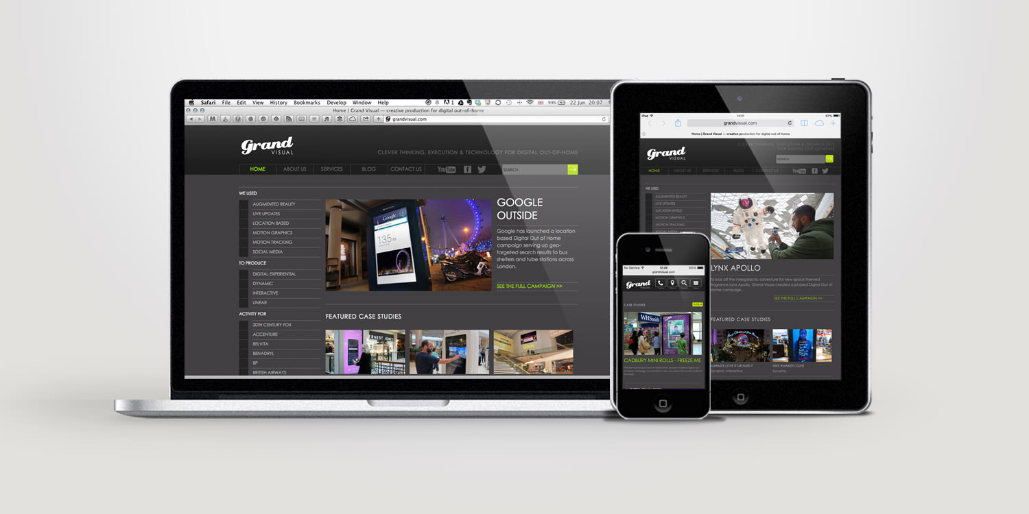
Have you asked yourself, “What is the responsive or responsive web design layout?” Responsive website design is an approach whereby a programmer produces a web page that reacts or resizes depending on the type of device he sees. It could be an unusual desktop resolution, a laptop, a 10-inch tablet, a 7-inch tablet, or a 5-inch Smartphone screen.
Responsive website design has become a hot topic in recent days, which may be due in part to the growing market for smart phones and other mobile devices. More and more people are using smaller screen devices to view web pages.
In reality, “For those who create web designs and solutions, all of this contributes to a remarkable conclusion: a million screens have bloomed and we have to build for each of them.”
What exactly does the layout of a responsive website look like? The main objective of a responsive design would be to have a single site, but with various elements or components that respond differently when viewed on devices of different sizes and dimensions. Take a conventional “fixed” website. When viewed on a normal computer screen, for example, the website may display three columns. , something that users don’t like Or the sections may be hidden or appear distorted. The effect can be complicated by the fact that many tablets can be viewed in portrait orientation or flipped sideways for a landscape perspective.
On a small Smartphone screen, websites can be even more difficult to see. Large images can divide the design. Websites can be slow to load on smart phones if they are heavy on graphics. However, if a website uses a responsive layout, the tablet variant can automatically adjust to have only two columns. In this way, the material is readable and easy to navigate. On a Smartphone, the material may seem unique, perhaps stacked vertically Or perhaps the consumer would be able to drag the view to see different columns.
The images will be resized instead of distorting the design or being cut. The goal is with a responsive website design layout, the sites automatically adjust according to the device in which the viewer sees it.
How does Responsive Web Design work? Responsive websites use fluid layout column structures. All the components of the page are dimensioned as a percentage of the screen rather than in pixels. Therefore, in the case where you have three columns, you would not say precisely what width each should be, but rather what should be the width in relation to the additional columns. Column 1 should consume half the page, Column 2 should consume 30 percent, and Column 3 should consume 20 percent, for example.
At Win Infoway, we’ve been providing good quality responsive websites for 5 years in Rajkot, India and around the world.


Leave A Comment